Digital Impact Alliance (DIAL)
-
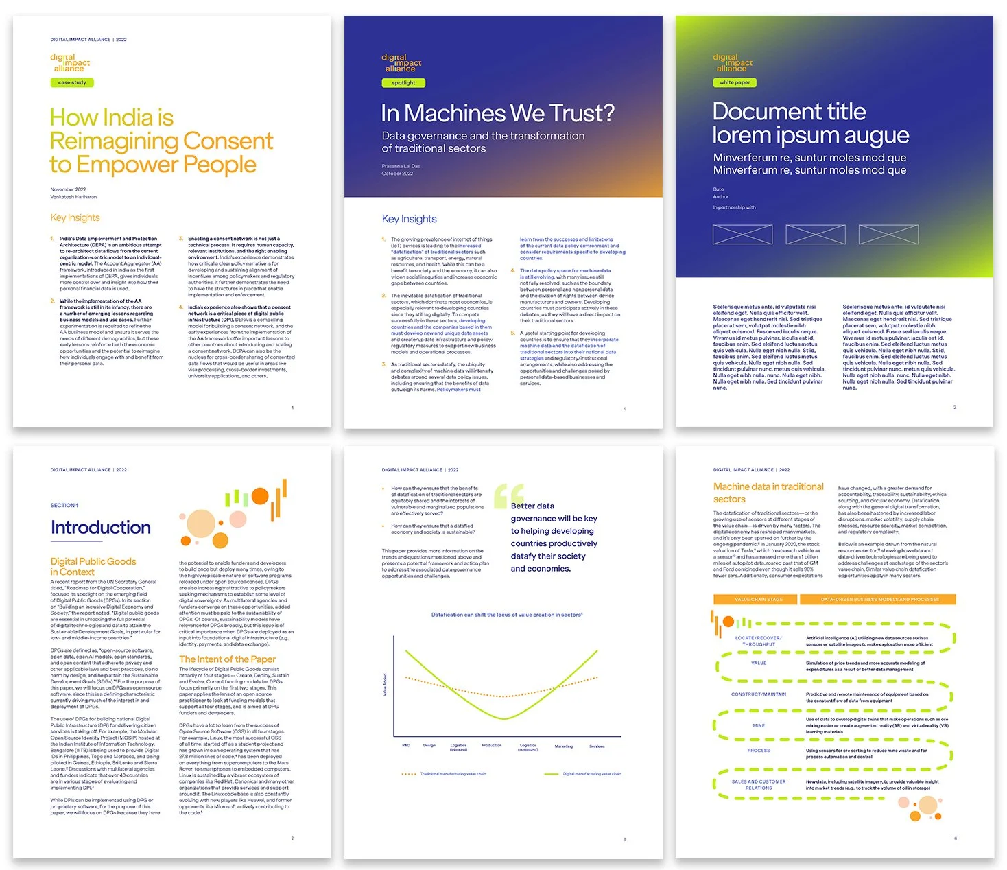
Central to the project was the development of an illustration style that balanced vibrancy, clarity, and a mandate for a sense of global inclusivity. This required a nuanced approach to design, creating visuals that captured DIAL’s innovative spirit without overshadowing the importance of its mission. The resulting style, rich with otherworldly colors, custom gradients, and geometric motifs, provided flexibility for multiple report types, ensuring each publication carried a consistent yet fresh visual narrative.
-
The design process emphasized readability and audience connection, adapting heavy data and technical content into visually digestible formats. Key design elements—such as bold color palettes, well-placed whitespace, and eye-catching icons—guided readers smoothly through complex compound ideas. Templates were developed to be both functional and adaptable, simplifying the creation of future reports while maintaining the integrity of the brand’s new visual identity.
-
The ultimate measure of success was the shift in how audiences experienced DIAL’s reports. By breaking away from traditional, overly formal layouts, the new designs fostered deeper engagement. Reports no longer felt like static documents but instead served as vibrant extensions of DIAL’s mission to drive digital transformation on a global scale. Feedback from stakeholders and partners confirmed the effectiveness of this approach, with many praising the reports for their energy, clarity, and inviting nature.
By introducing a playful yet sophisticated visual identity, the redesigned reports embody DIAL’s global vision and modern ethos. This project demonstrates how thoughtful design can elevate brand perception, enhance communication clarity, and invite stakeholders into a deeper dialogue about digital impact and innovation.
-
Creative Direction
Art Direction
Team Size: 4
United Nations Foundation
Reimagining the report designs for the UN Foundation’s Digital Impact Alliance (DIAL) meant cultivating a visual language as dynamic and forward-thinking as the organization itself. The challenge lay in crafting a unique illustration style that reflected DIAL’s vibrant yet underutilized brand elements, while ensuring the reports maintained intellectual rigor without feeling overly formal. By developing and integrating colorful illustrations, nuanced gradients, and adaptable templates, the project transformed traditional reports into visually engaging experiences that resonated with a diverse and global audience.