Wheatley Institute
creative direction, concept, brand, print & merch design
-
The primary challenge was to respect Wheatley's deep-rooted legacy while positioning the brand for the future. This required thoughtful consideration of its history, values, and mission. The name change symbolized more than simplification—it reflected a commitment to accessibility and relevance, making the brand feel more approachable without losing its credibility or stature.
-
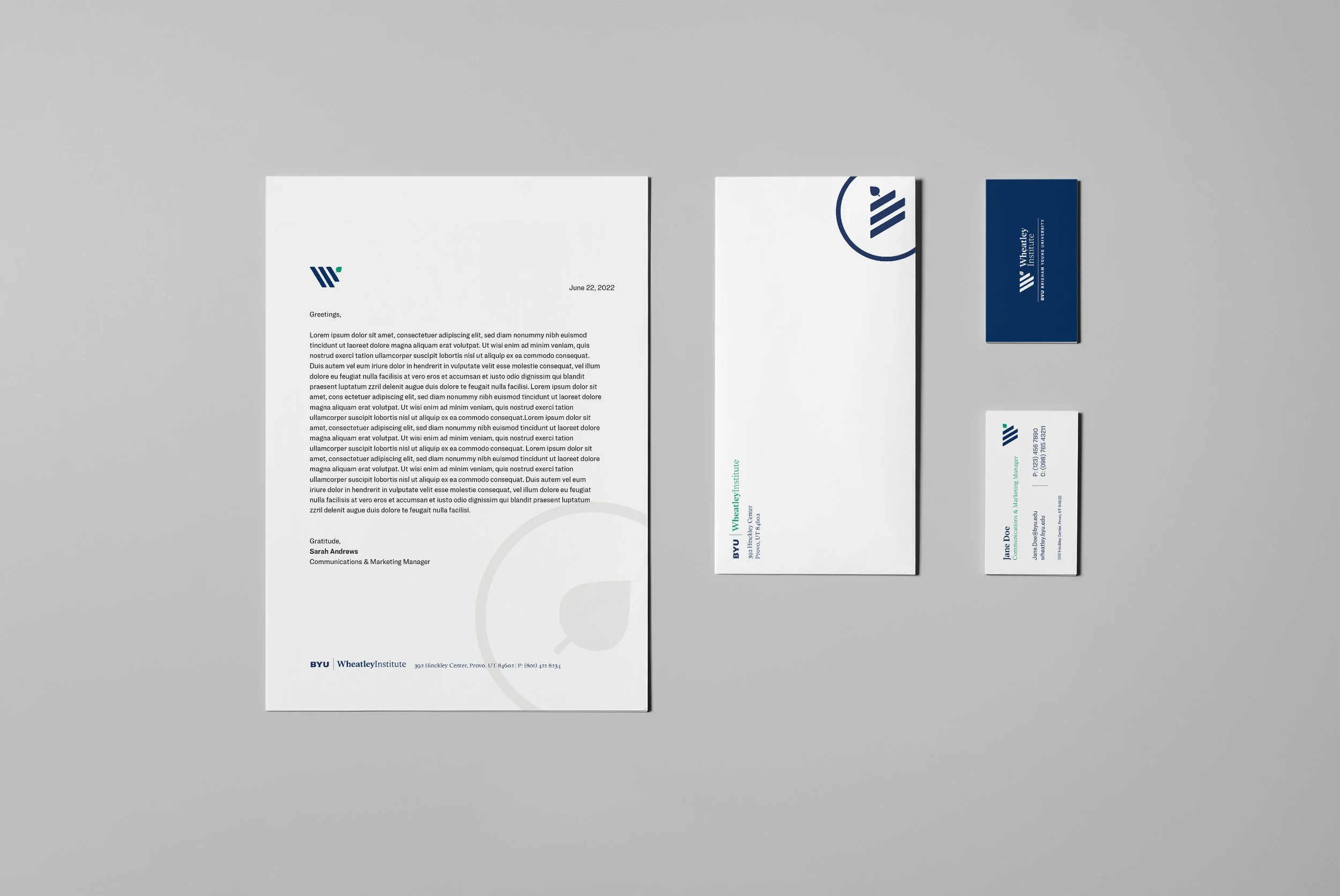
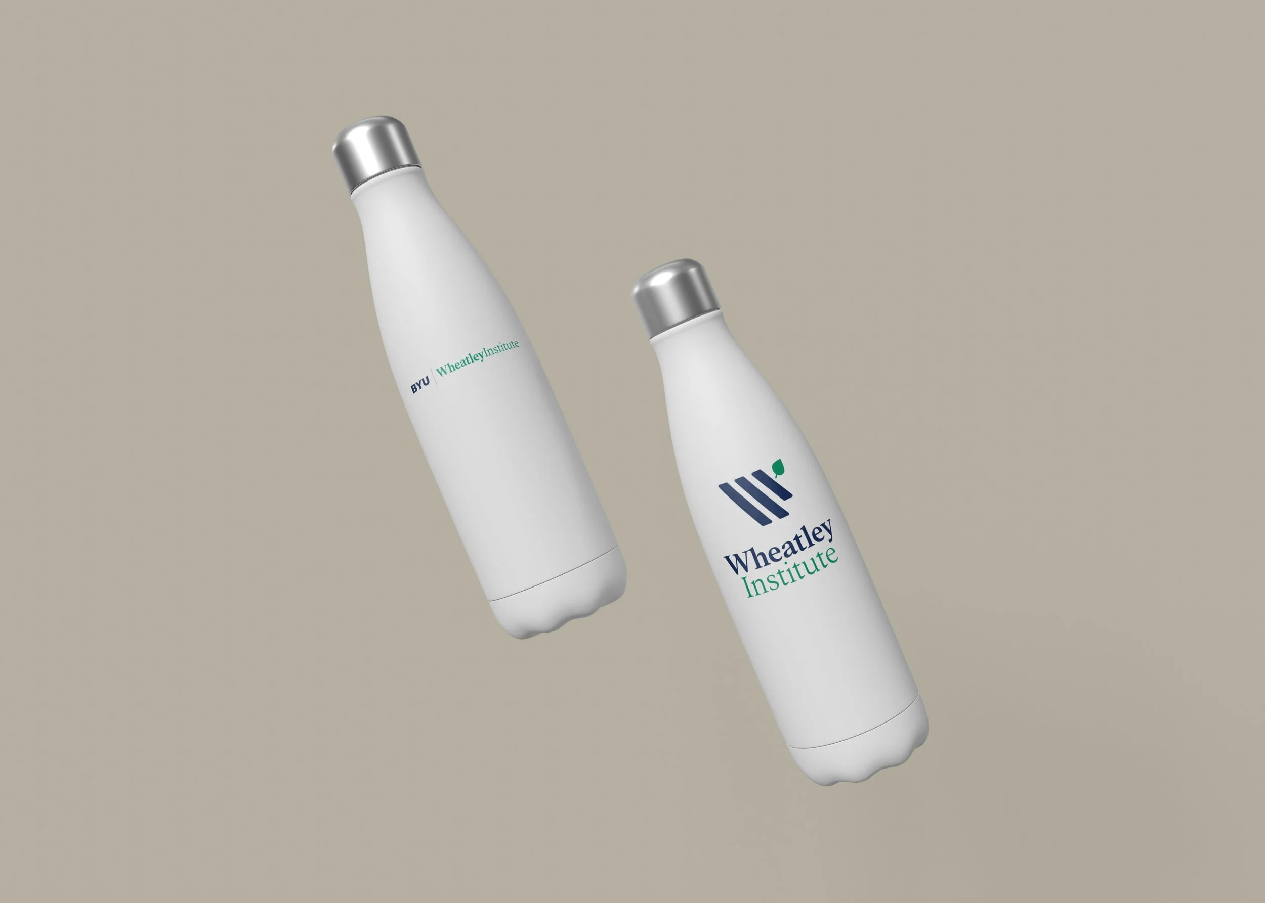
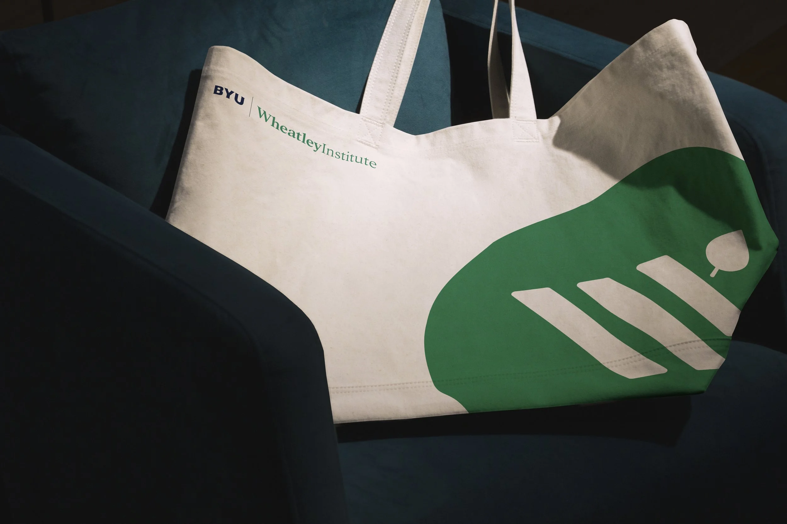
Key to the rebranding was a comprehensive overhaul of the visual identity. A refined logo, inspired by the iconic leaves of BYU’s campus—many of which were quite literally seeded by Jack and Mary Lois Wheatley—bridges tradition with clean, modern aesthetics. The design system includes a flexible palette of colors and typefaces that harmonize sophistication and approachability, ensuring the brand resonates across both digital platforms and print materials, and most importantly, families effortlessly with BYU’s brand. Specific elements, such as timeless serif-font headers juxtaposed with vibrant accent colors, create a dynamic tension that underscores the brand’s evolution.
-
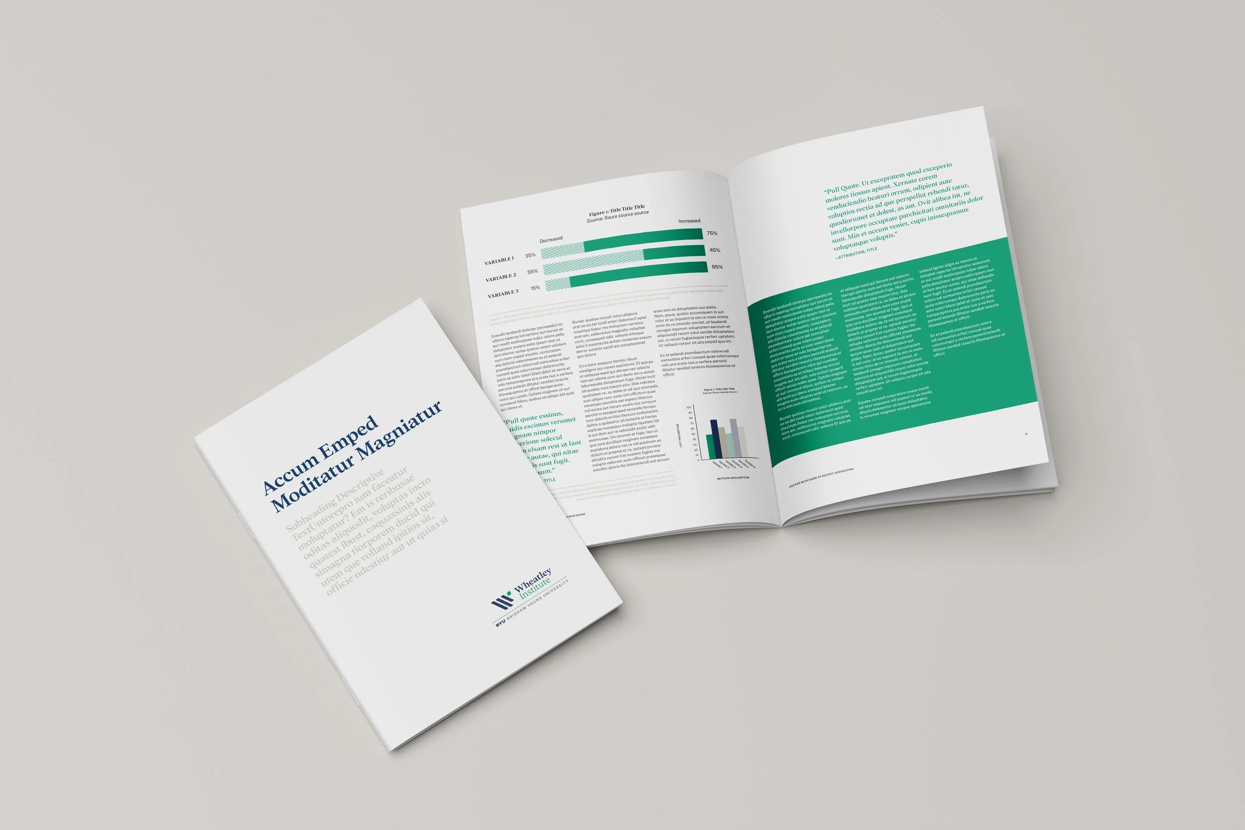
The brand refresh was designed to deepen Wheatley Institute’s connection with its audience. Clear messaging and accessible design elements invite a sense of inclusion while maintaining authority. Digital templates now allow for streamlined communication, and print media—including event programs and reports—showcase the brand’s elegance and adaptability. Each piece works cohesively to reflect the organization’s role as a leader in intellectual discourse.
By honoring tradition while paving the way forward, the updated Wheatley Institute brand achieves unity of past and present. This integrated approach empowers the organization to engage its audience with clarity and impact, ensuring its ideas continue to resonate in an evolving world.
-
Creative Direction
Creative Process Management
Brigham Young University
Reimagining the identity of Wheatley Institute meant navigating the delicate balance between honoring its prestigious legacy and ensuring its relevance in a modern context. This ambitious branding project underscored the importance of clarity and connection, leading to a pivotal recommendation that the organization refine its name from "The Wheatley Institute" to the more streamlined and contemporary "Wheatley Institute." Through logo design, brand identity development, and the creation of a versatile visual system, the work has redefined how Wheatley engages with its audience while preserving the gravitas of its institutional heritage.